This limited palette is not only a tribute to Zorn's mastery, but also a challenge for modern artists to experiment with the power of limited color selections. In this tutorial we will explore how to use the Zorn palette to create an overview map, allowing you to visualize a wide range of hues by mixing the colors together and varying their lightness and darkness.
Tutorial: How to Make an Overview Map of the Zorn Palette
Step 1: Preparation and Materials
Before we start, you will, of course, need the materials:
- Paint in the colors Ivory Black, Yellow Ochre, Cadmium Red Light and Titanium White.
- A palette and brushes
- Water for thinning the paint.
- Paper for making the overview map.
Step 2: Mixing and Testing Colors
Start by squeezing small amounts of each color onto your palette. Then take some time to experiment with mixing the colors to create new shades. Try different ratios and combinations and make notes of the results.
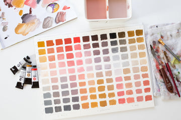
Step 3: Creating the Overview Map
Step 4: Label and Organize
Once all of the colors have been applied and dried, label each section with the name of the color and any notes regarding mixing ratio and lightness/darkness.
Organize your overview map in a logical way, for example by color order or based on the mixing ratios you used.
Step 5: Reflection and Use
Take some time to review and analyze your overview map. What colors and mixing ratios appeal to you the most? Make notes of your observations and findings for future reference.

Conclusion
The Zorn palette offers a powerful and versatile selection of colours, allowing you to create a wide range of shades and nuances by simply mixing the colours together and varying the lightness and darkness. With an overview map you can effectively visualise these colours and use them as a reference for your future paintings.
Have fun experimenting and enjoy exploring the possibilities of the Zorn palette!
Love,
Judith